A note
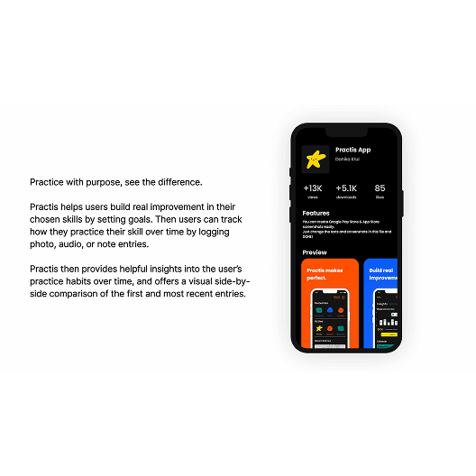
Practis is a UX and branding project that pushed me to think about designing the whole world and ecosystem of an app, from an app’s core functionality to its branding, and user interfaces. I used Figma for the design and prototyping of the app, then created the branding in Adobe Illustrator, and illustrations in Procreate.
The unique challenge of this project was conceptualizing an original app with it’s own branding, alongside the UX design.
The app had to feel needed and fill a gap in the market, and it also had to appeal to people of student age.
Process
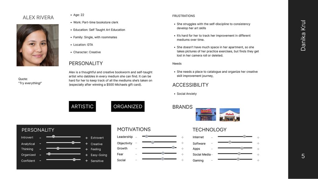
After conducting market research and an analysis of current practice tracking app features, I was able to move forward and pin down who Practis would be made for. This was explored through creating personas and considering their needs.
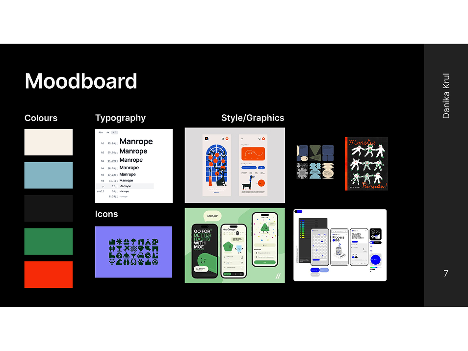
Once the path forward began to focus, I collected colours, a webfont, and inspiration for the UI elements/illustration style. This gave me a solid visual framework to have in mind as I began the app’s architecture.
At this junction, I took my research insights and began grouping sticky notes of features to define the apps structure.
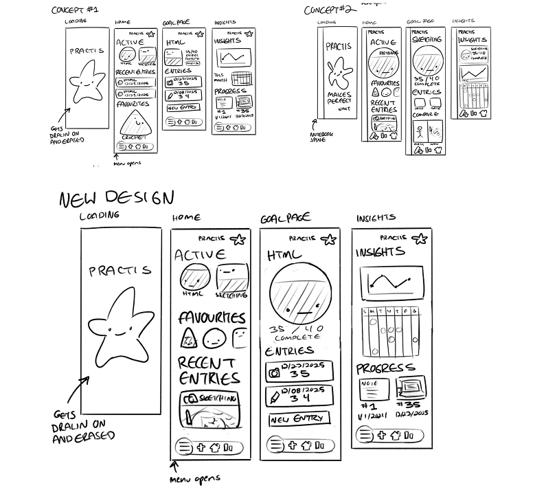
Then I proceeded to draft wireframe sketches in Procreate.
P.S.
Lessons and outcomes
- This process improved my ability to use strategic design to target a particular group of users, and bring original ideas from loose concepts to a prototyped product.
- I would have loved to put more time into illustrating for this project, as well as looking at some more unique ways to visualize the data gathered by logging practice sessions.

1
The final design appeals to the targeted user base with its simplicity and charming illustrated touches.
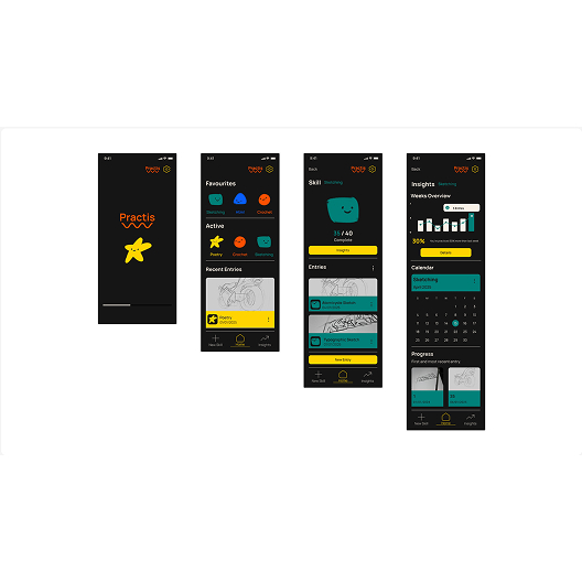
2
Users are also able to quickly and conveniently log practice sessions.
3
The insights are visible and easy to understand at a glance, and the whole project feels visually cohesive.
Leave a Reply