Category: Ux

ux case study

  • A Mouse Was Cooking Porridge: Interactive Hand Game Website

    A Mouse Was Cooking Porridge: Interactive Hand Game Website

    A note:

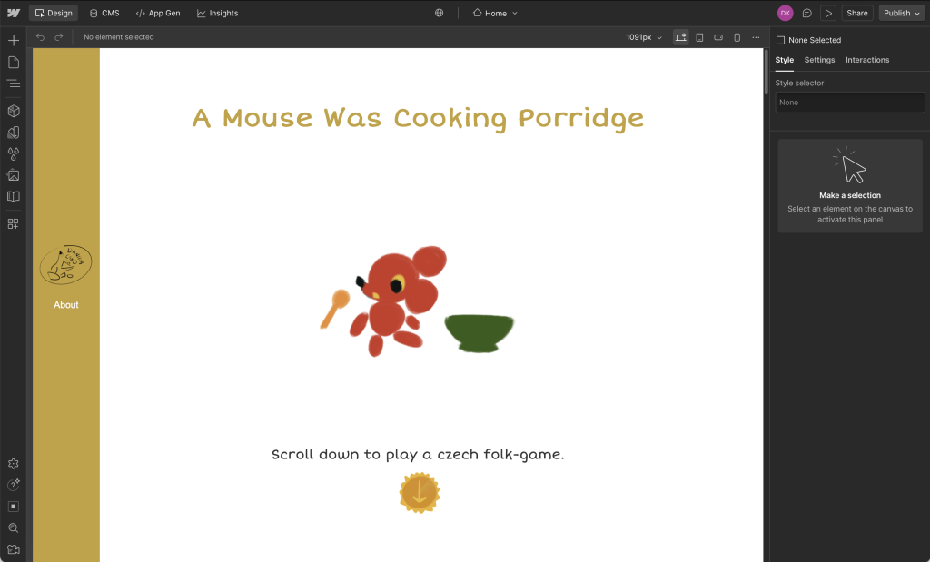
    I created this website to share a little-known hand game and rhyme from Czechia. It tells a story for children, while teaching you the accompanied hand-moves for each line. As a child, I loved when grandmother would play this with my cousins and I.

    Process

    The first step in creating this website was in developing the concept. I went with a vintage children’s picture book style to convey the intended audience, yet resonate with viewers of all ages.

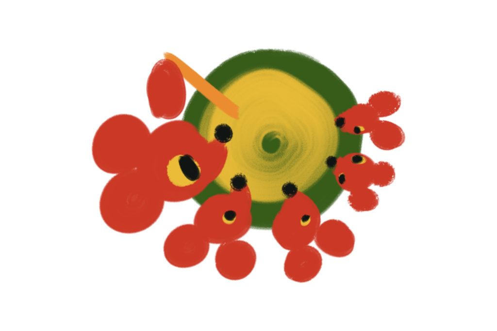
    For the design of the characters, I intended to give the mice a clear family resemblance with the same fur and eye colours, but give them each a different size.

    Then I created the list of story beats, and sketched out the required illustrations.

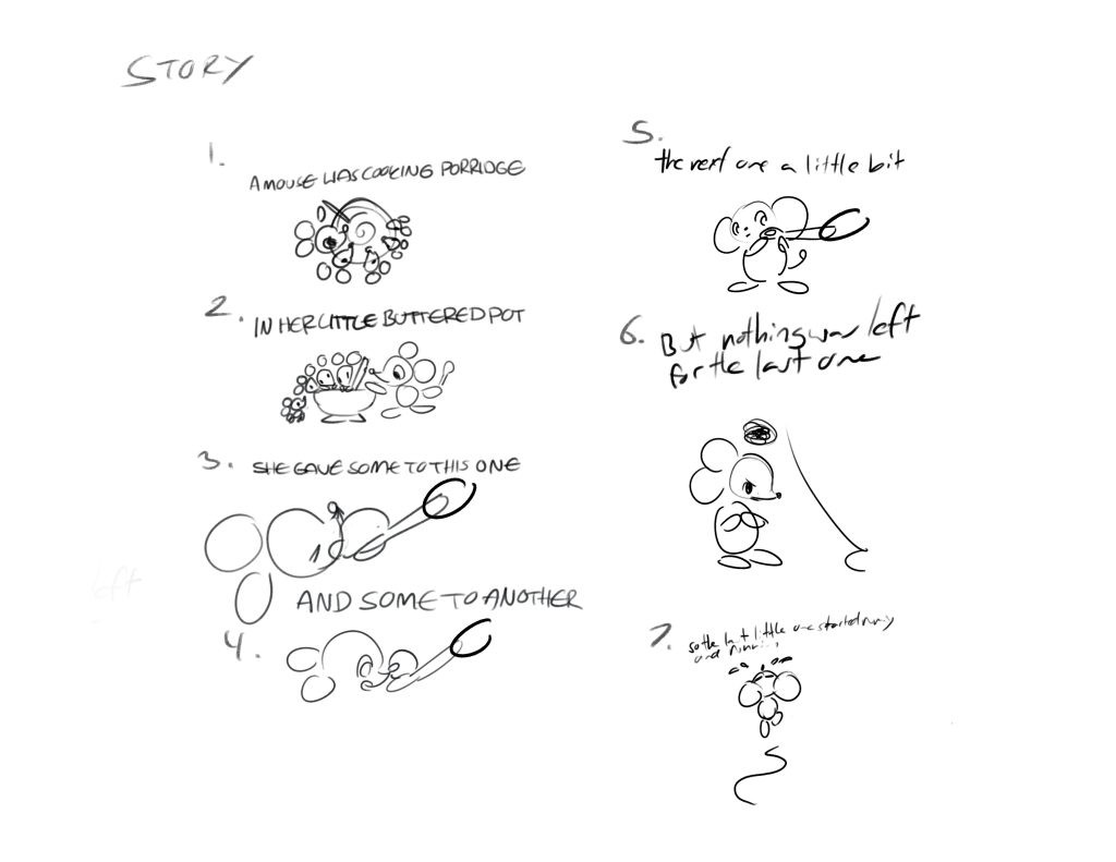
    Then I created the final illustrations, including the hand movements.

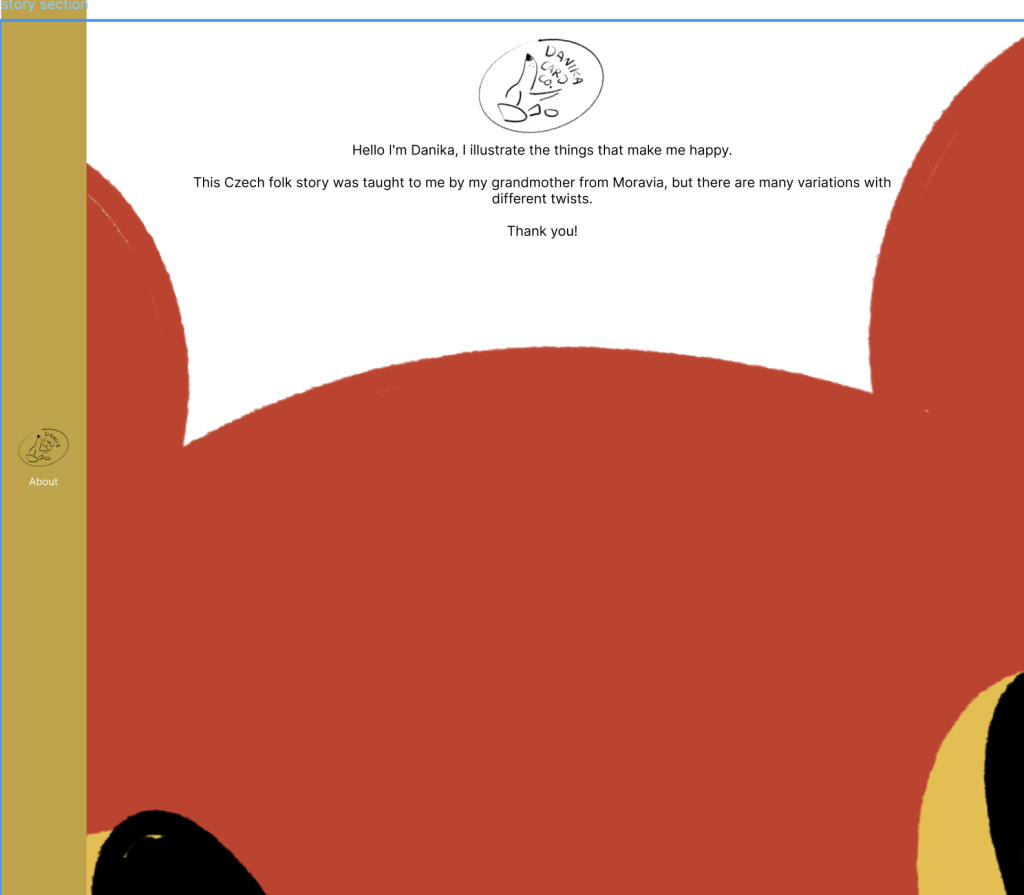
    To design the website itself, I first used Figma to prototype both mobile and web versions of my site. I also wrote and illustrated an about me for visitors to read.

    Then I built out the live website using Webflow.

    P.S.

    Lessons and outcomes

    • This project taught me a lot about designing for block-based editors like Webflow.
    • I love this style and would like to make an animated version of the story with these assets and a real recording of the story.

  • Practis App

    Practis App

    A note

    Practis is a UX and branding project that pushed me to think about designing the whole world and ecosystem of an app, from an app’s core functionality to its branding, and user interfaces. I used Figma for the design and prototyping of the app, then created the branding in Adobe Illustrator, and illustrations in Procreate.

    The unique challenge of this project was conceptualizing an original app with it’s own branding, alongside the UX design.
    The app had to feel needed and fill a gap in the market, and it also had to appeal to people of student age.

    Process

    User persona for Practis. The user is a young woman with many creative hobbies.

    After conducting market research and an analysis of current practice tracking app features, I was able to move forward and pin down who Practis would be made for. This was explored through creating personas and considering their needs.

    The Practis app moodboard with colour, type, and reference images.

    Once the path forward began to focus, I collected colours, a webfont, and inspiration for the UI elements/illustration style. This gave me a solid visual framework to have in mind as I began the app’s architecture.

    App sketches.

    At this junction, I took my research insights and began grouping sticky notes of features to define the apps structure. 
    Then I proceeded to draft wireframe sketches in Procreate.

    P.S.

    Lessons and outcomes

    • This process improved my ability to use strategic design to target a particular group of users, and bring original ideas from loose concepts to a prototyped product.
    • I would have loved to put more time into illustrating for this project, as well as looking at some more unique ways to visualize the data gathered by logging practice sessions.
    User and business goals.

    1

    The final design appeals to the targeted user base with its simplicity and charming illustrated touches.

    Displays all screens of the finished app.

    2

    Users are also able to quickly and conveniently log practice sessions.

    Mockup of app on the App Store.

    3

    The insights are visible and easy to understand at a glance, and the whole project feels visually cohesive.