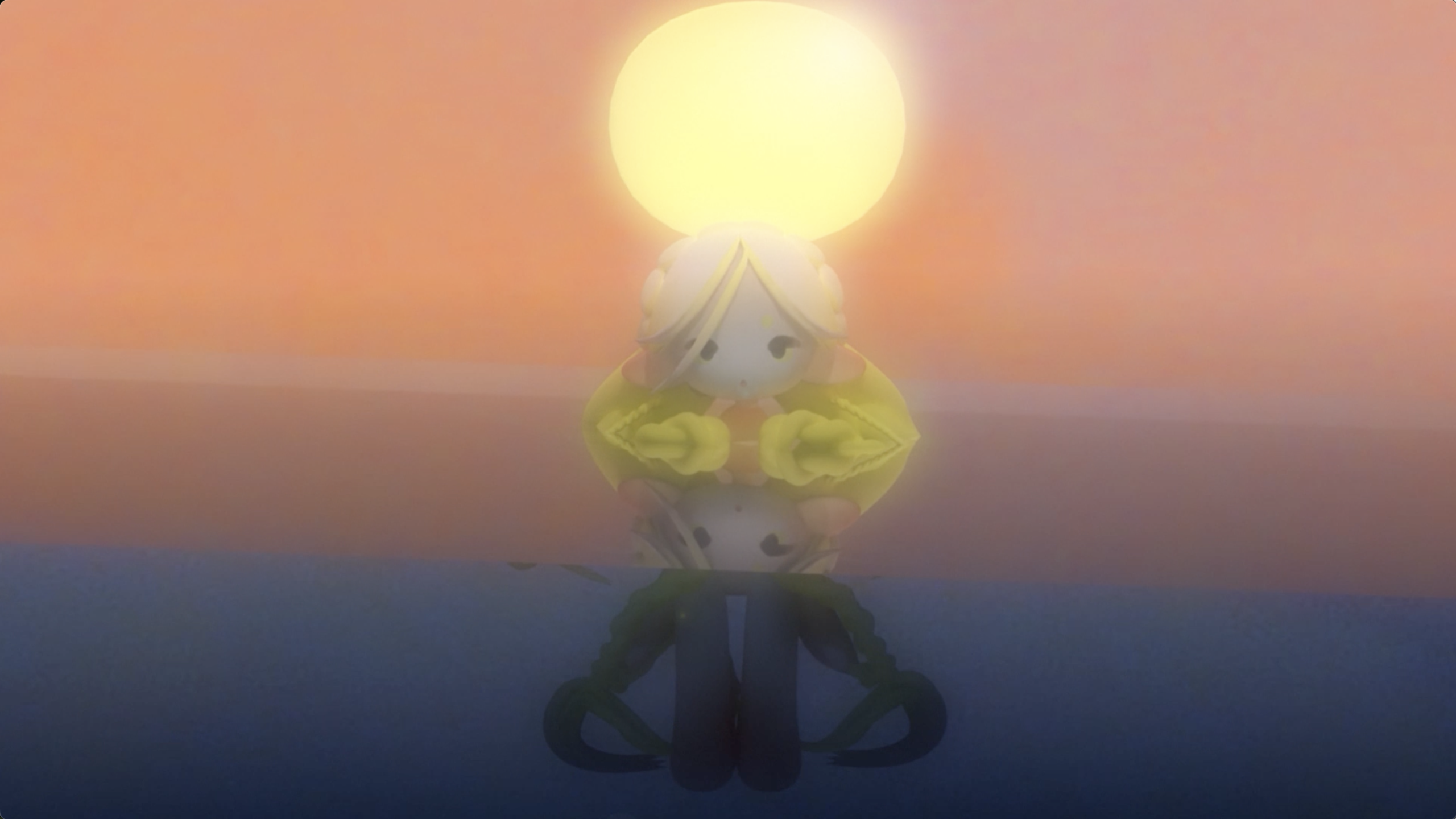
This looping Blender 3d animation depicts a stylized version of Rusalka, a water nymph.
Process
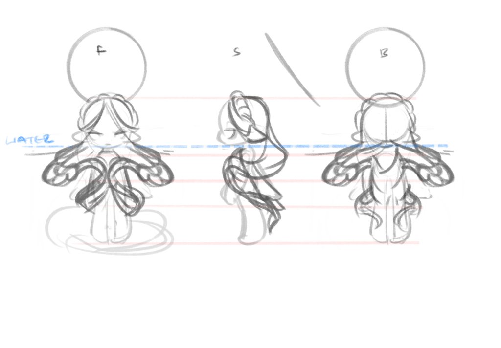
The first step in creating this animation, was sketching out ideas for my character model in a turnaround.
Then I modelled out the character, rigging the limbs, and parenting the hair to move with the head.
Next, I hand-painting custom textures onto the face to reduce sculpting and rendering time.
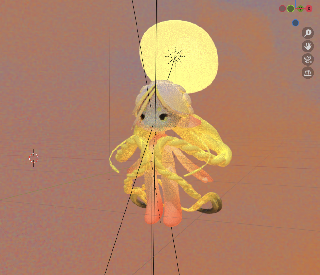
I then styled the environment, and fine-tuned the material shader nodes.
The viewport render of the model without water.
P.S.
Lessons and outcomes
This project was challenging, as it was one of my first times rigging and animating a render in blender. In the end, learning Rigify, and the built in key framing system felt really rewarding.
There is still room for improvement, but this experience makes me excited to pursue more 3d projects in the future.
This magazine layout challenged me to express the word endless through a typography-focused piece, paired with an article layout.
Process
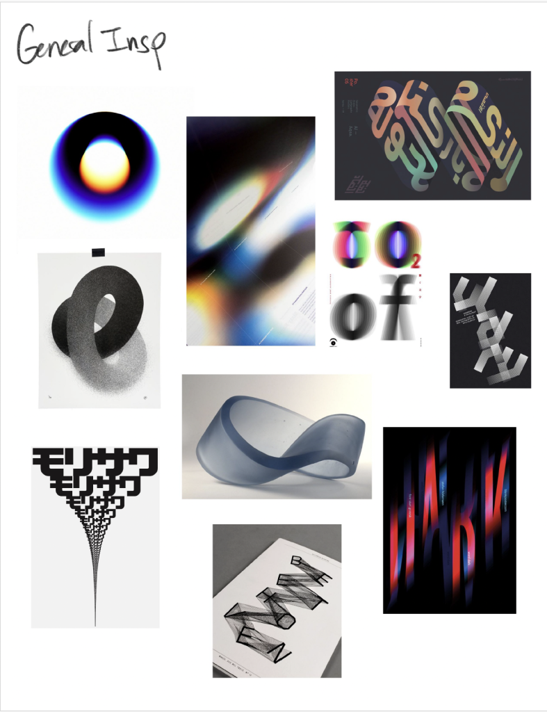
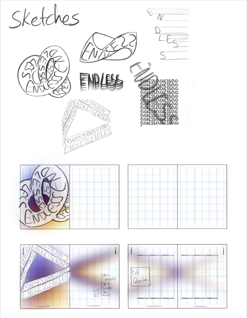
The first step in creating this animated short, was gathering inspiration and creating a moodboard. Then I sketched a few different concepts and layouts.
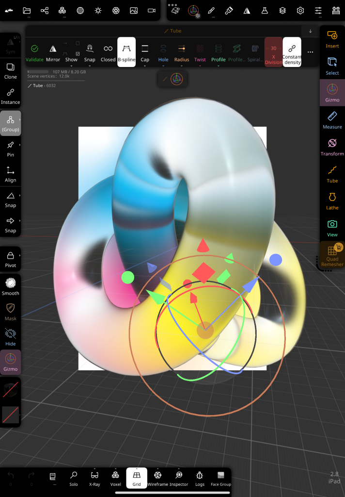
The I started modelling. The idea for the expressive component was to create an endless shape with the lettering superimposed on the model’s surface.
Although I normally use Blender, for this project I tried Nomad Sculpt for the iPad. It’s incredible how accessible 3d design is becoming hehe.
P.S.
Lessons and outcomes
While I liked exploring Nomad Sculpt’s Simplified interface, it did feel limited, and I had to manually superimpose the text with photoshop to get the desired result.
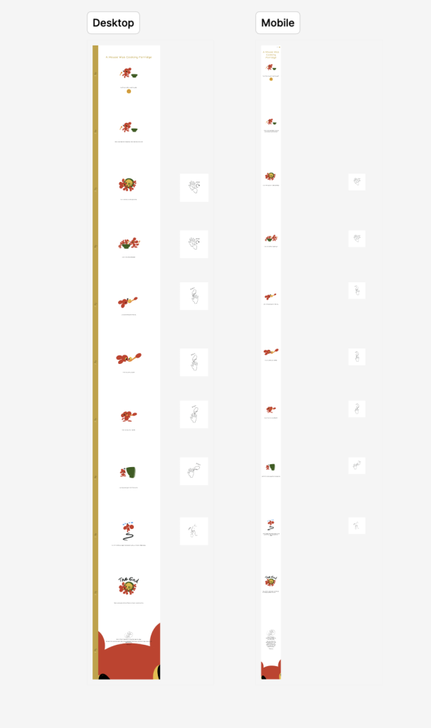
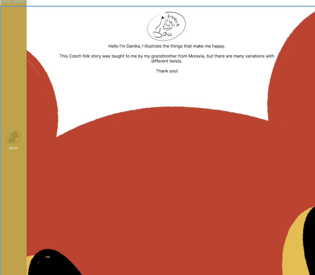
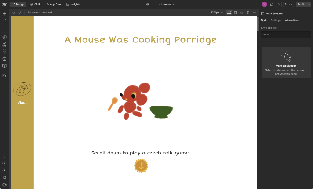
I created this website to share a little-known hand game and rhyme from Czechia. It tells a story for children, while teaching you the accompanied hand-moves for each line. As a child, I loved when grandmother would play this with my cousins and I.
Process
The first step in creating this website was in developing the concept. I went with a vintage children’s picture book style to convey the intended audience, yet resonate with viewers of all ages.
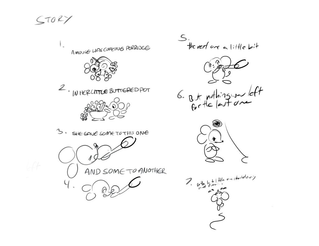
For the design of the characters, I intended to give the mice a clear family resemblance with the same fur and eye colours, but give them each a different size.
Then I created the list of story beats, and sketched out the required illustrations.
Then I created the final illustrations, including the hand movements.
To design the website itself, I first used Figma to prototype both mobile and web versions of my site. I also wrote and illustrated an about me for visitors to read.
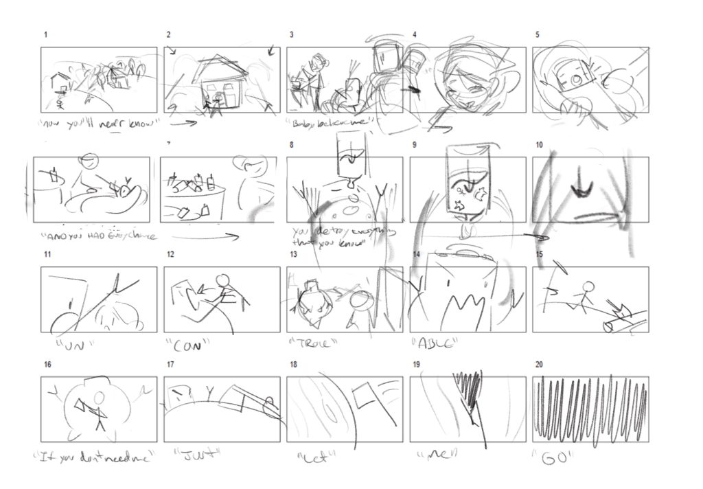
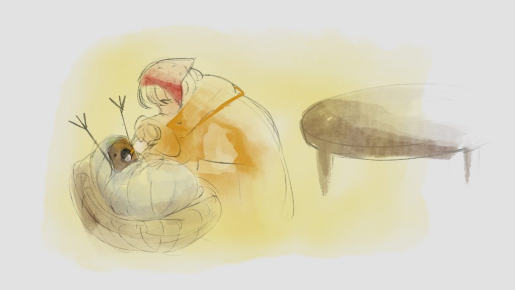
This Procreate Dreams animation tells the story of Otesanek or Greedy Guts, from the folk stories collected by Karel Jaromír Erben.
Process
The first step in creating this animated short, was gathering inspiration and creating a moodboard.
Then I chose the soundtrack, and started storyboarding alongside the music and lyrics. The frames from this storyboard were used to make an animatic to fine tune the timing and get a feel for the final piece.
I also explored style frames with colour, before deciding on a sepia tone for a cohesive, paper-like finish.
P.S.
Lessons and outcomes
This project challenged me to draw many frames by hand in a short timeframe, and I learned a lot about scaling back when needed.
I would like to recreate this in the future, but I love the dynamic feel to some of the transitions. Perhaps rotoscoping, and increasing the frame rate could help smoothen the finish, and tighten up some of the stylistic variation between the scenes.
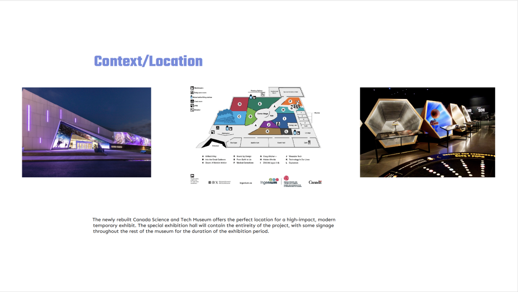
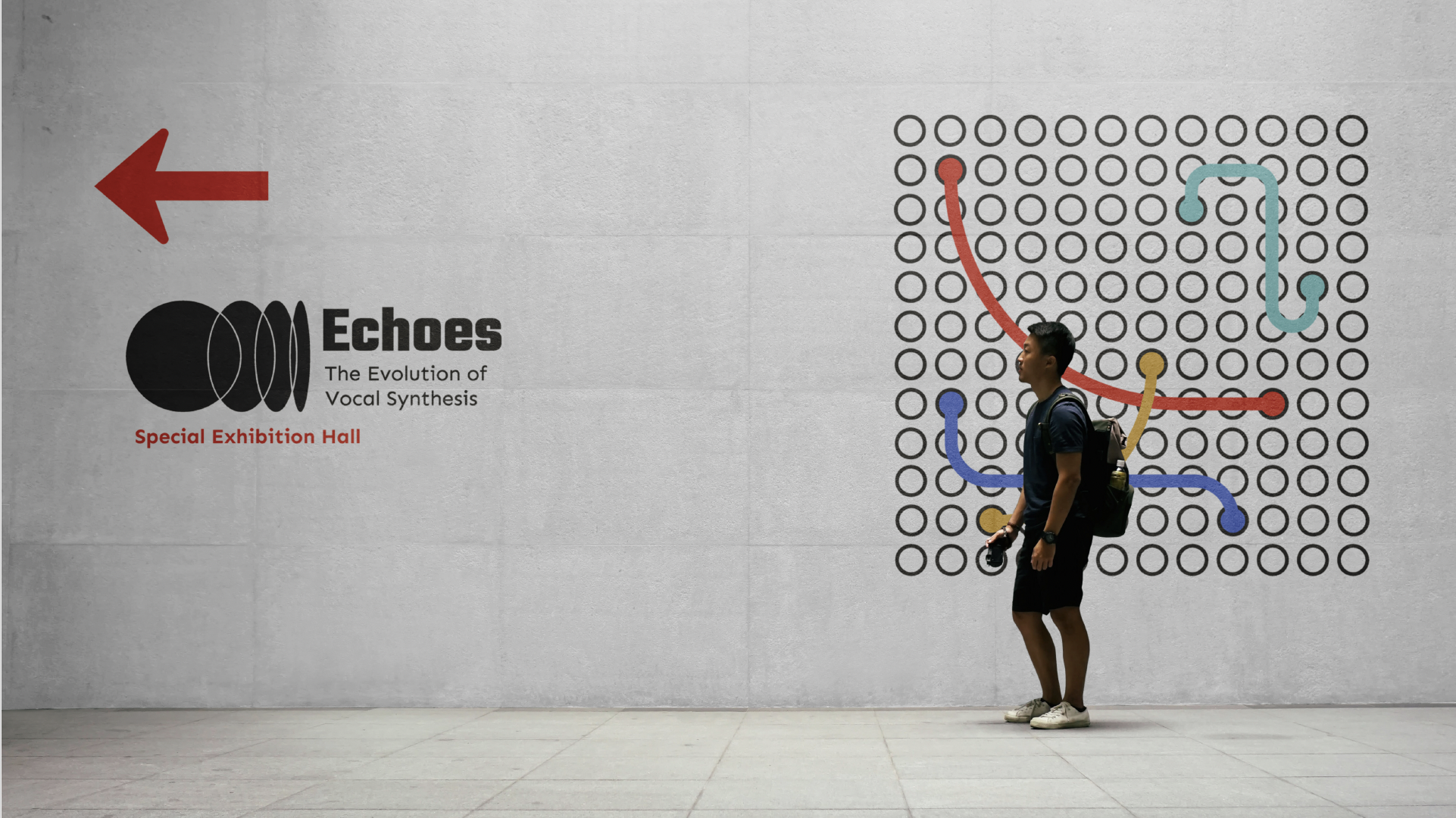
“Echoes: The Evolution of Vocal Synthesis” is a fictional museum pop-up event to be held at the Canada Science and tech Museum, that teaches about vocal synthesizing from formant synthesis, to Modern AI vocals.
The unique challenge of this project was creating a design system for an exhibit, that would include a brand identity, way finding, and module/event design.
Process
After researching the new partner of the Canada Science and Tech Museum Ingenium, and the proposed exhibit location, I gathered all the necessary context in one place.
The Moodboard takes colour inspiration from Hatsune Miku, the design of analog synthesizers and patch wiring.
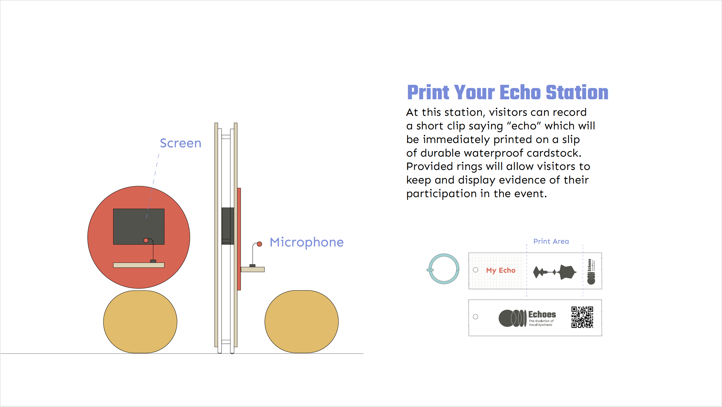
I then drafted ideas for the exhibit itself, and what kind of modular components I’d need to make it a reality.
P.S.
Lessons and outcomes
This experience, gave me a better understanding of how different elements of a design system can be blended in a way that’s cohesive and accessible for way-finding purposes.
1
The final exhibit gives visitors a unique chance to learn about vocal synthesis, while participating in one of a kind experiential learning stations.
2
Every element is designed to be as mobile and modular as possible.
3
The design is fun and appealing to workers, children, and parents. Yay.
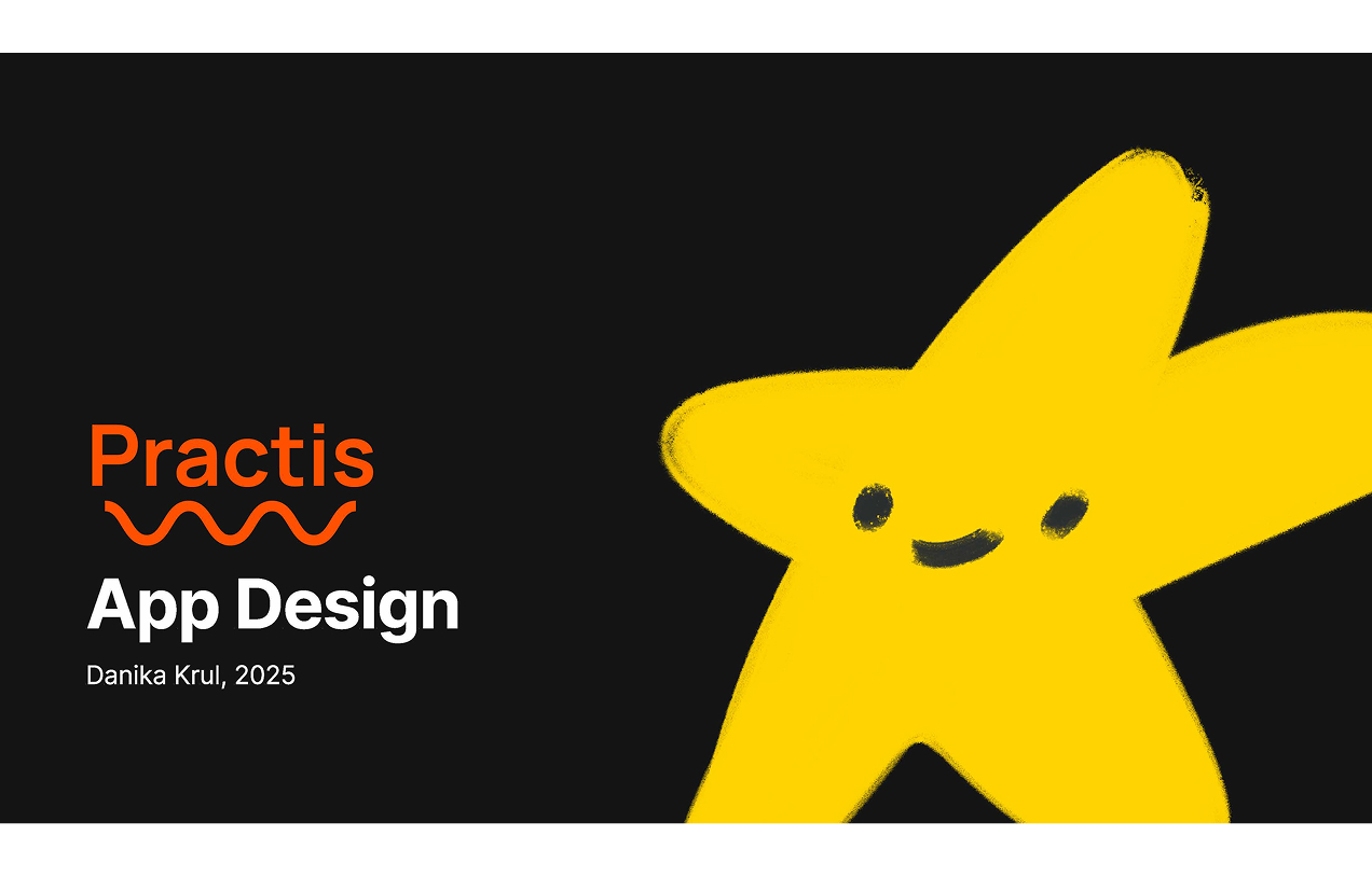
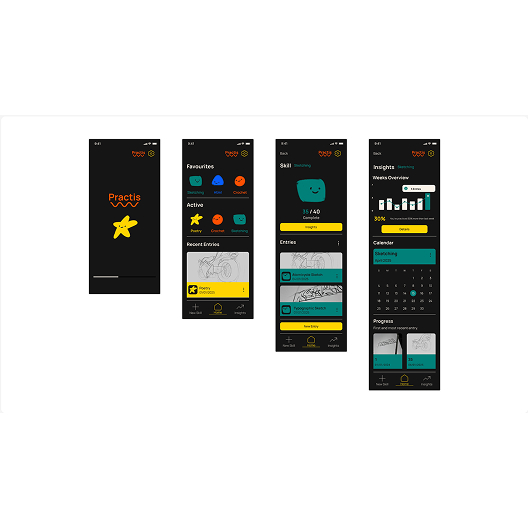
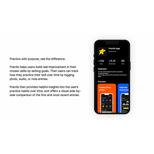
Practis is a UX and branding project that pushed me to think about designing the whole world and ecosystem of an app, from an app’s core functionality to its branding, and user interfaces. I used Figma for the design and prototyping of the app, then created the branding in Adobe Illustrator, and illustrations in Procreate.
The unique challenge of this project was conceptualizing an original app with it’s own branding, alongside the UX design. The app had to feel needed and fill a gap in the market, and it also had to appeal to people of student age.
Process
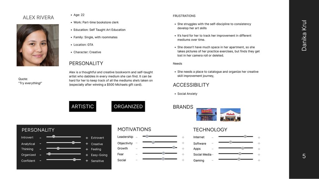
After conducting market research and an analysis of current practice tracking app features, I was able to move forward and pin down who Practis would be made for. This was explored through creating personas and considering their needs.
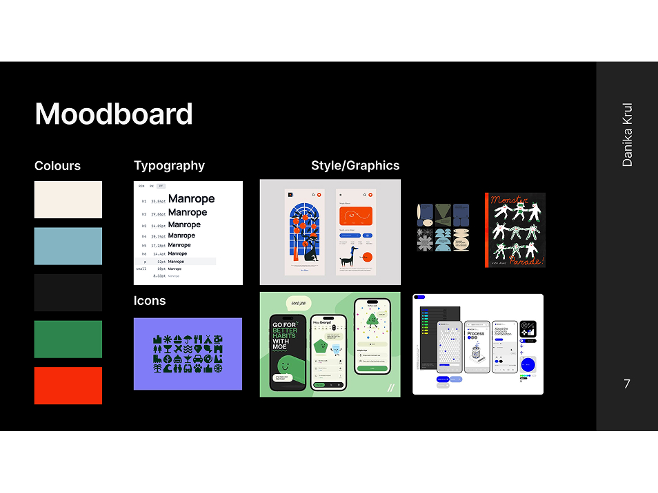
Once the path forward began to focus, I collected colours, a webfont, and inspiration for the UI elements/illustration style. This gave me a solid visual framework to have in mind as I began the app’s architecture.
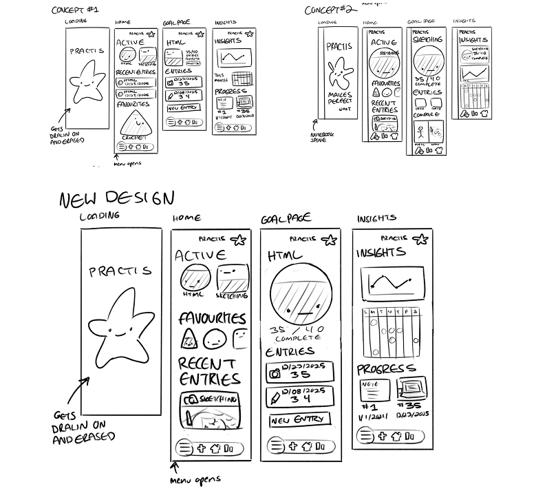
At this junction, I took my research insights and began grouping sticky notes of features to define the apps structure. Then I proceeded to draft wireframe sketches in Procreate.
P.S.
Lessons and outcomes
This process improved my ability to use strategic design to target a particular group of users, and bring original ideas from loose concepts to a prototyped product.
I would have loved to put more time into illustrating for this project, as well as looking at some more unique ways to visualize the data gathered by logging practice sessions.
1
The final design appeals to the targeted user base with its simplicity and charming illustrated touches.
2
Users are also able to quickly and conveniently log practice sessions.
3
The insights are visible and easy to understand at a glance, and the whole project feels visually cohesive.